This logo and branding project was for a new accessory bag for tiki mugs to carry them to bars. The idea was to show how the bag could be shortened to fit different sized mugs. To that effect, creating a tiki motif was paramount to conveying the idea of the bag.
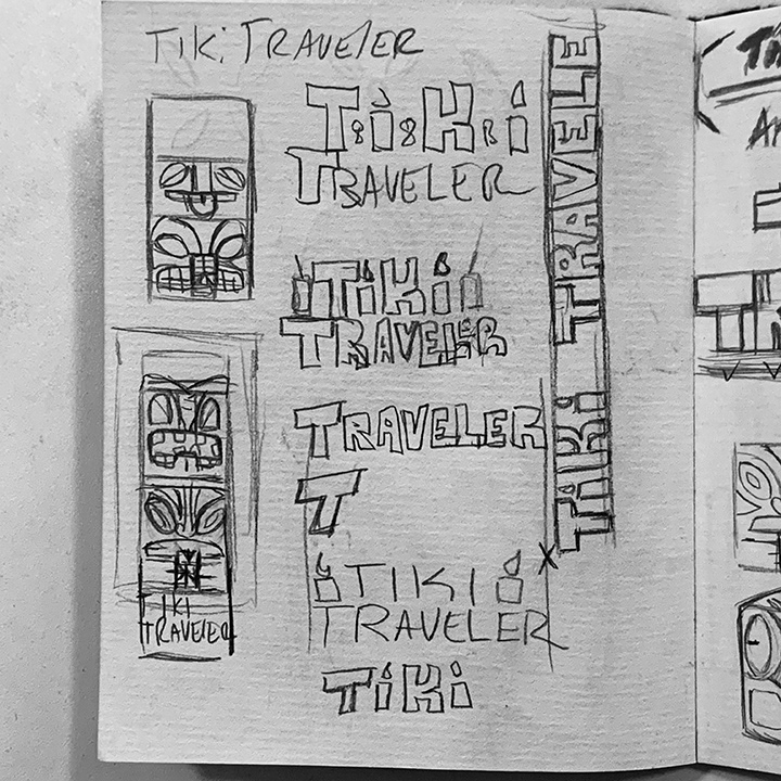
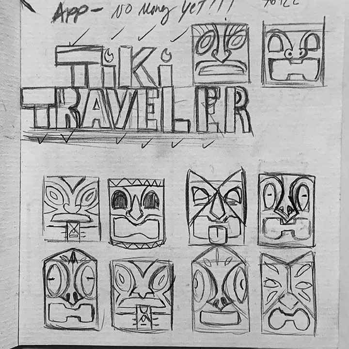
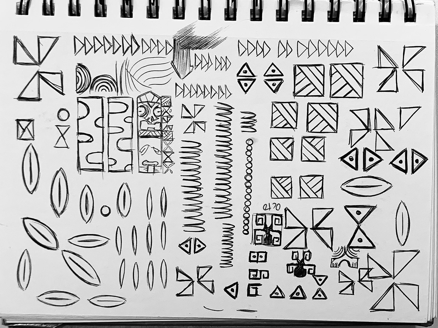
These initial sketches were the first concepts revolving around the idea of of a tiki totem that when folded down to half, would still show off one of the faces including the name of the product.
Once the faces were selected and digitized, the texted was a readjusted version of the Tiki Island font, a classic typeface that has been one of the best examples of tiki. So the text was modified to fit the style of the logo.
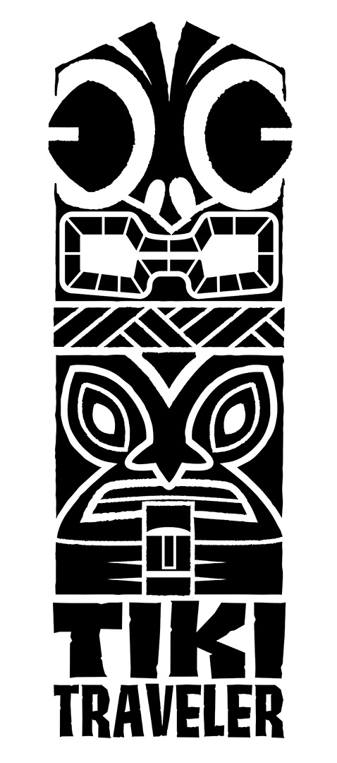
While the logo was solidified it still felt a bit lacking so there was a decision to add a bit more tiki motifs to the overall design to complete it. With this in mind, looking over references of patterned materials used in tiki culture, these patterns were sketched then digitized.
The final design was a combination of the original tiki totem sketches and some of the patterns created to create a more complete piece of art that could be used in a variety of areas for branding.
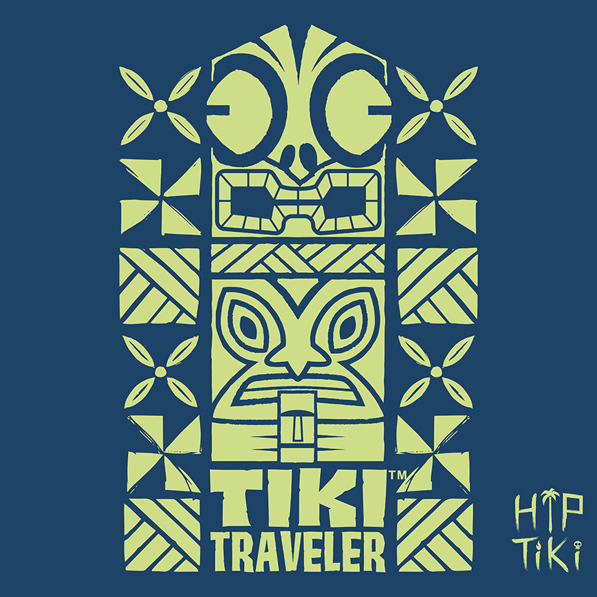
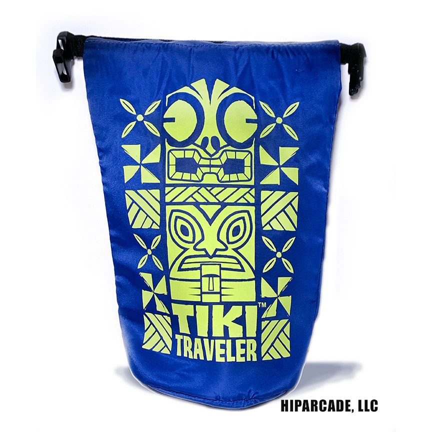
And the final image on the actual product.