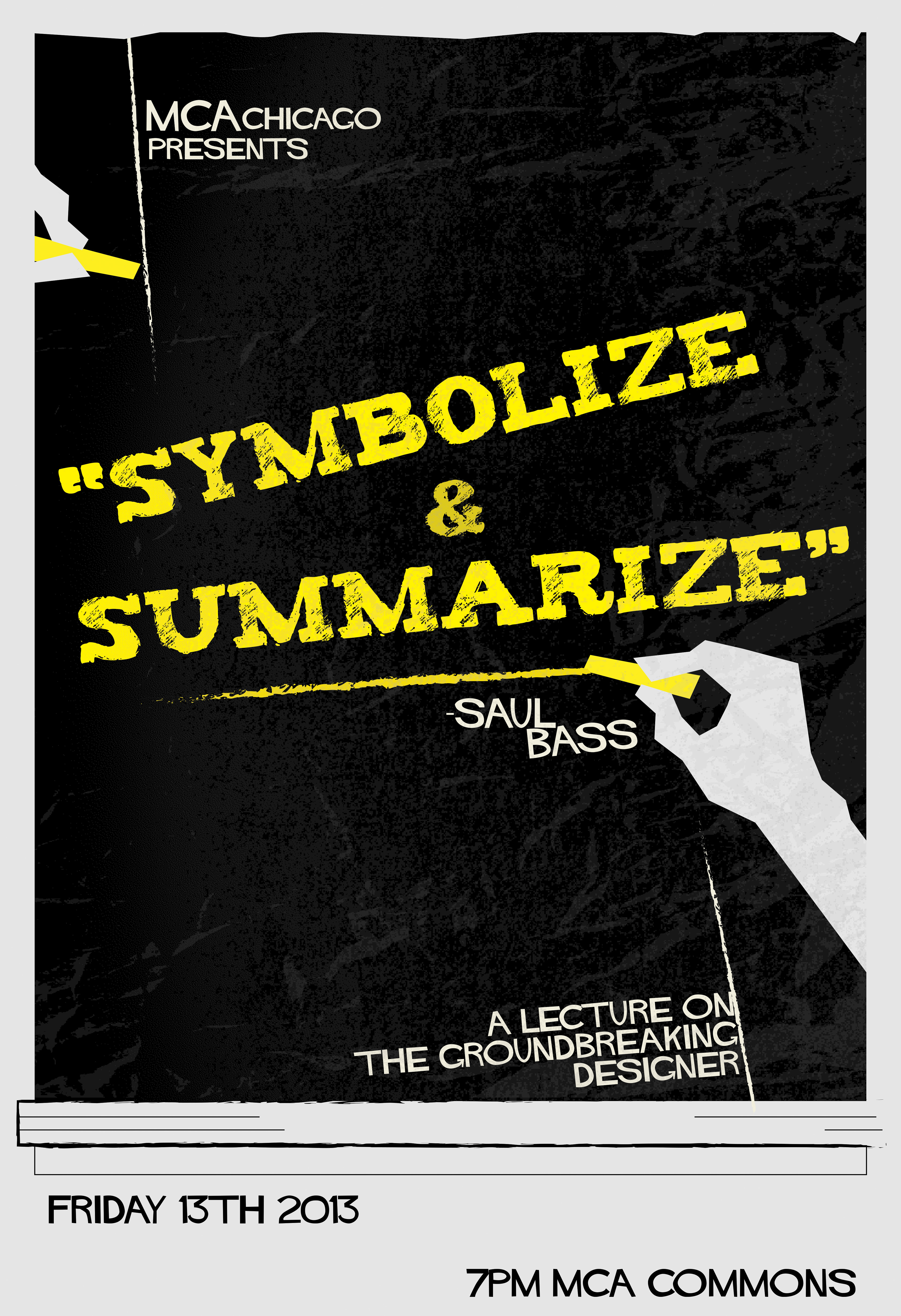
Using a quote of the late great designer, I wanted to build a poster very similar to his style but make it appealing in a more academic way. I was still trying to figure out the layout.
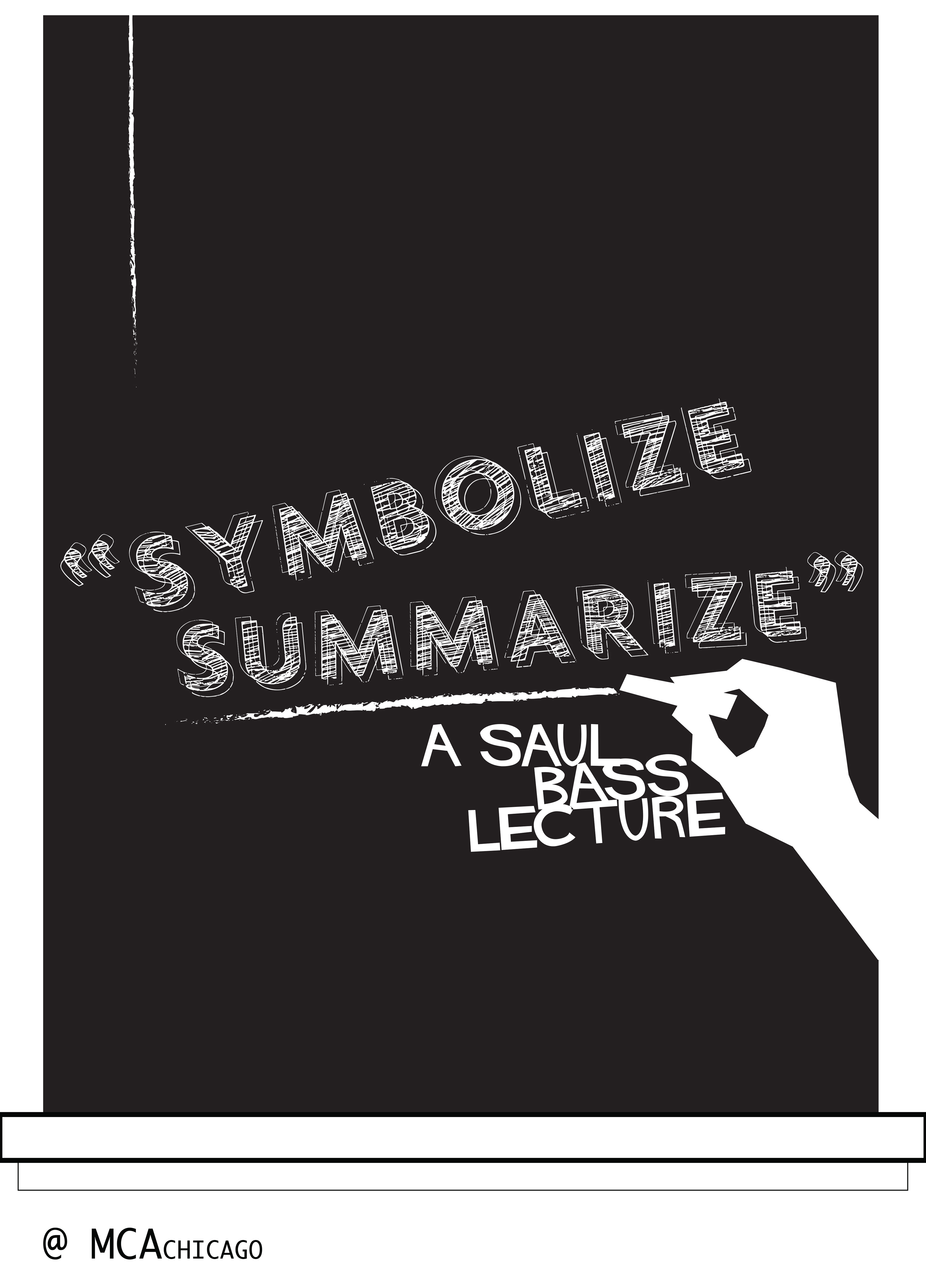
The initial idea came to me as if someone was writing on a white board or chalkboard. Hence the black. I also like working in grayscale to develop the layout before going into color. I don't want to waste much time at the beginning and just want to focus on the line of action.
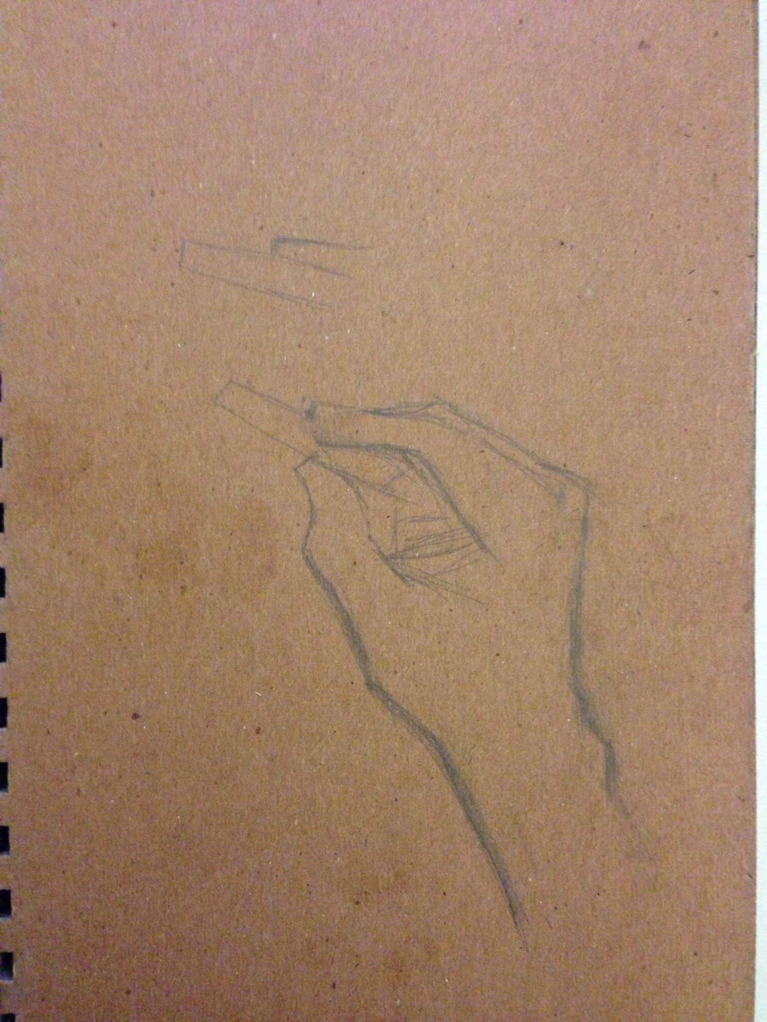
In order to convey that this was a blackboard I felt I need to show some chalk or a hand writing. Using the style popularized by Bass, taking a quick snapshot of myself, I sketched out a hand in a holding position on found paper and quickly traced it in Illustrator to pop into the following images.
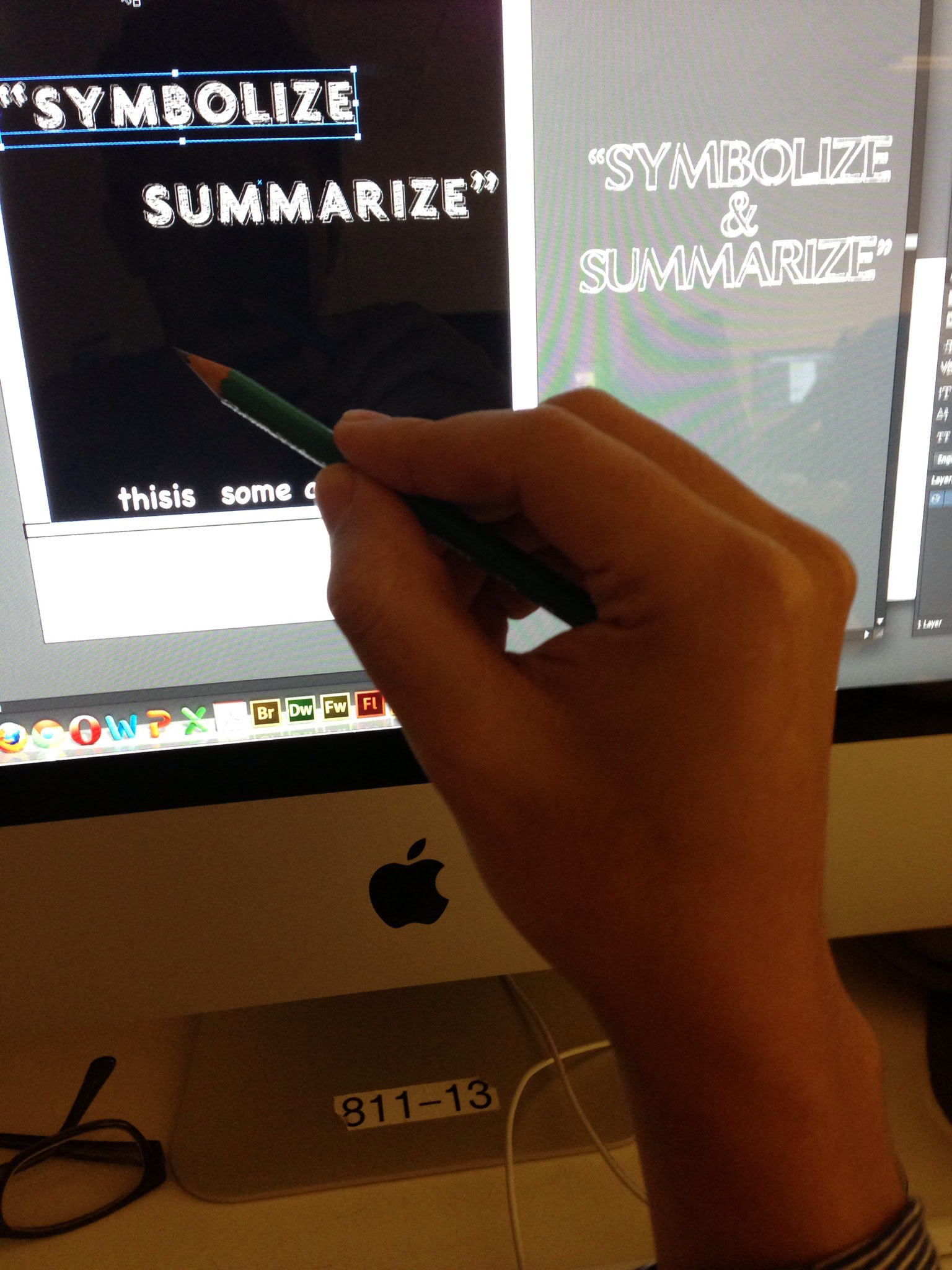
With the hand traced into the scene I began to add a few more text and stroke elements in order to compose the rest of the design. Also using the popular Bass created styled font for his Hitchcock Vertigo poster.
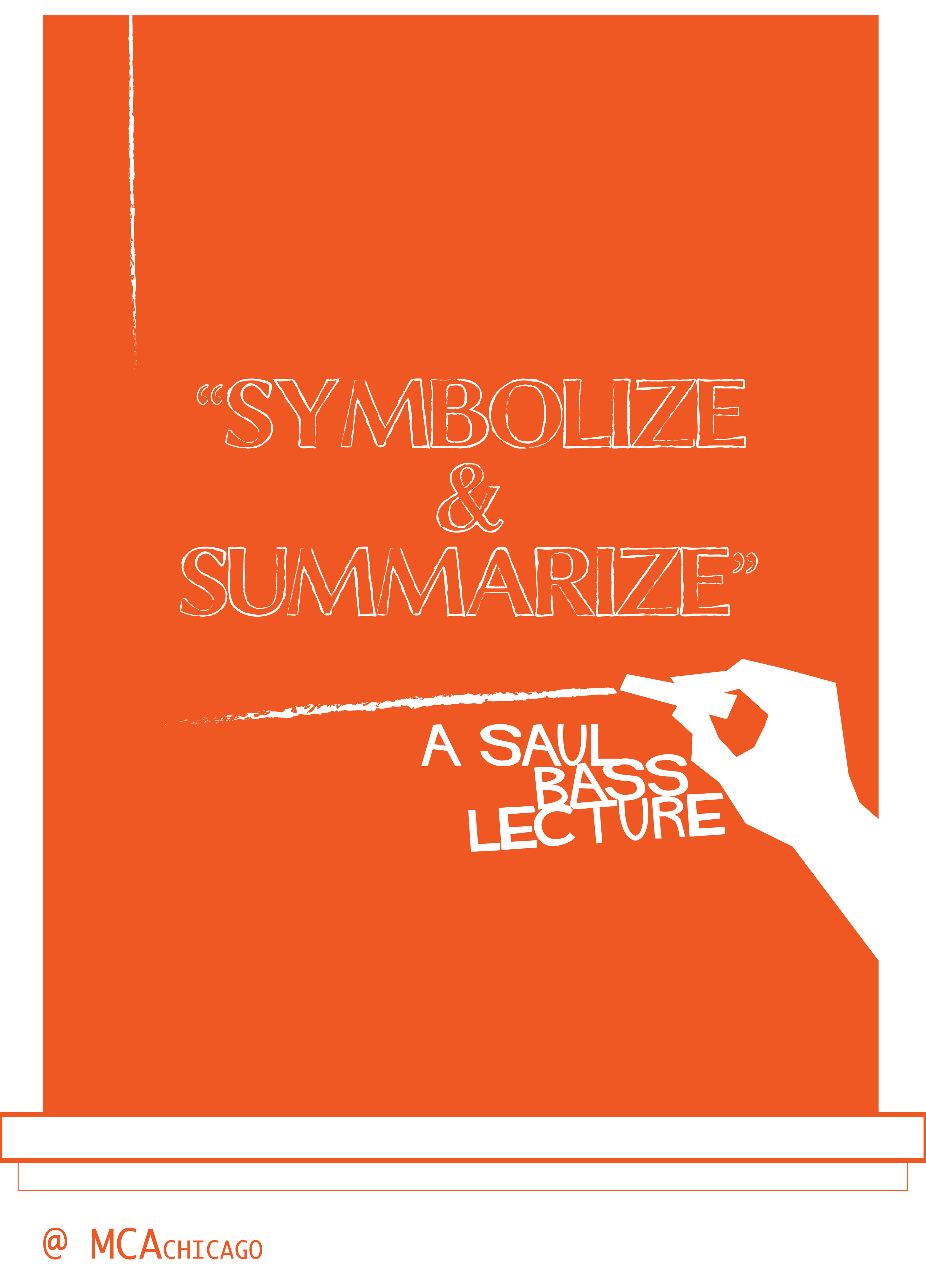
Still playing around with layout and font selection, I decided to add some color just to see how the contrasting of the hands would handle with something other than black.
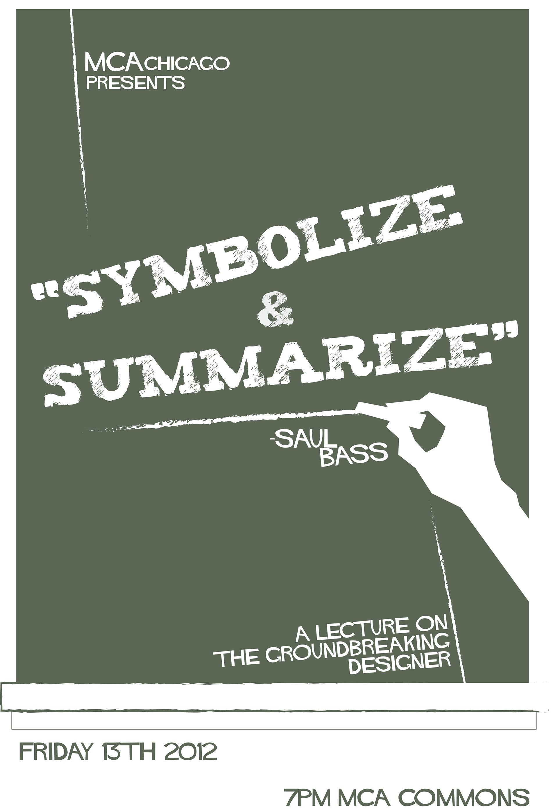
Moving text around and finalizing most of the layout, I decided on an aged sage green, to be similar to a real chalkboard and to stray from just an all black chalkboard, which I think would have worked just as fine as well, as you'll see towards the end I did two versions.
The final designs. Back in the day I was so fond of the yellow chalk we used in school so I went with that specific color for the main title chalk marks as well as highlights in the held chalk to contrast the hand's fingers. I also added a second barely visible hand in the opposite direction for some balance. In order to give this piece a more aged look, I tinted the "white" underlying background and overlayed some bitmap vector tectures I created with crumbled up papers to over lay on the board itself clipping everywhere else. To give that effect of an aged paper as well as almost giving the chalkboard some smudging as they were never truly clean. I like to think of small details like that, that can enhance a design so subtly.
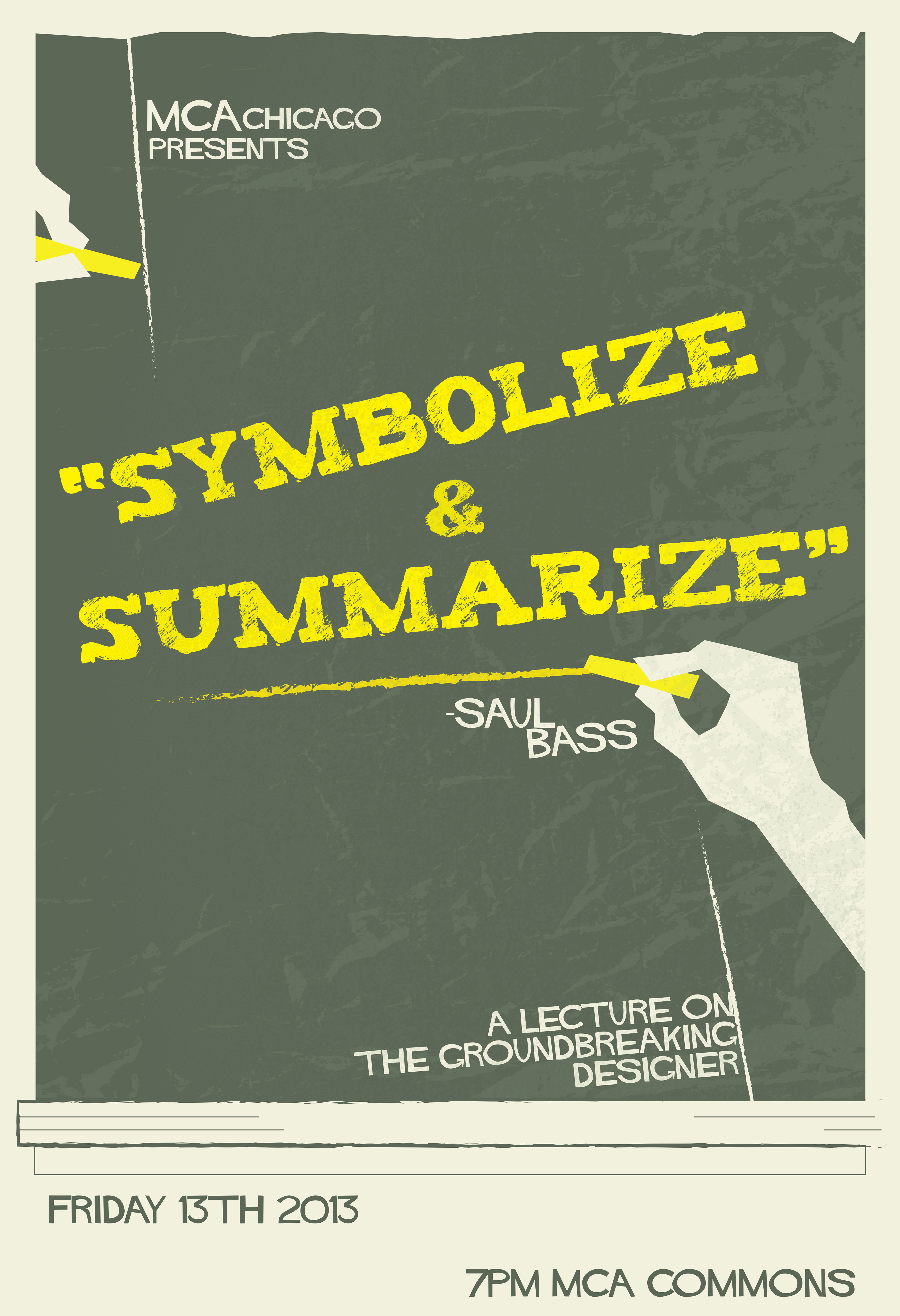
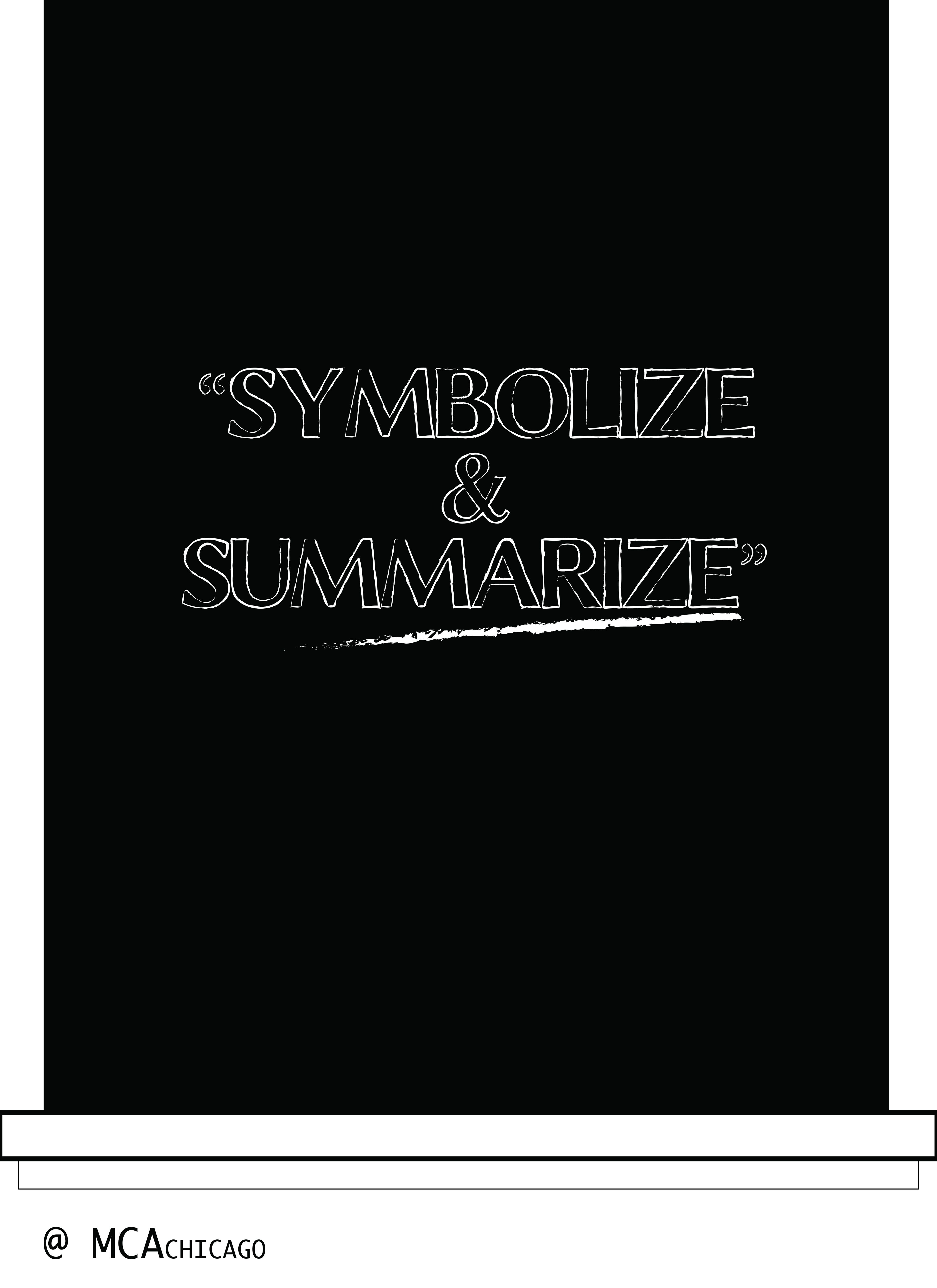
2nd variant. Now it's up to the client.