The concept was to come up with a design for the Fantastic Four while keeping the core of the team in place. We couldn't use actual likenesses from films or anywhere else, nor could we draw them as children, engaging with smoking or drinking.
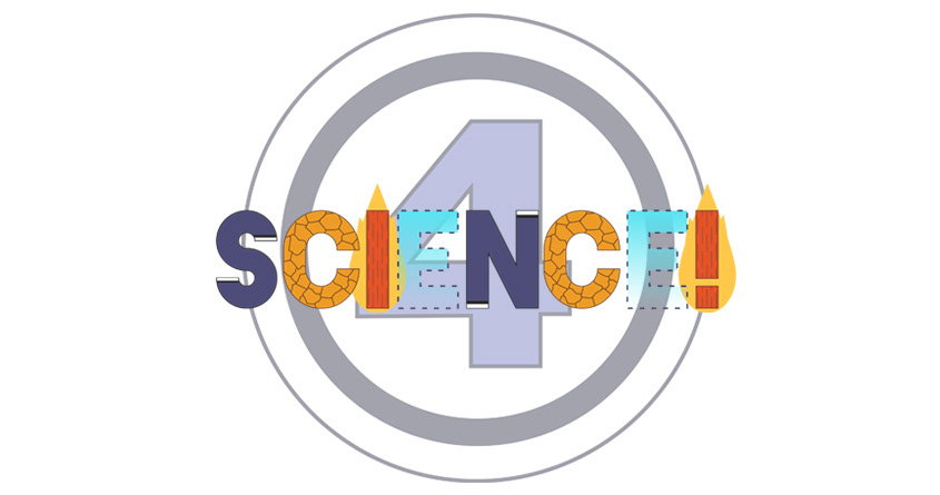
My concept was simple enough. They're each identifiable on their own based on their abilities and I chose to focus on that and what they stood for. Which was the pursuit of science. I thought of writing something like, "I <3 SCIENCE!", but I figured "4 SCIENCE!" made more sense to incorporate their classic logo.
I originally picked a font I liked which was Blackout and printed a copy of it so I could go over my ideas before taking it into Illustrator. This was my initial sketch.
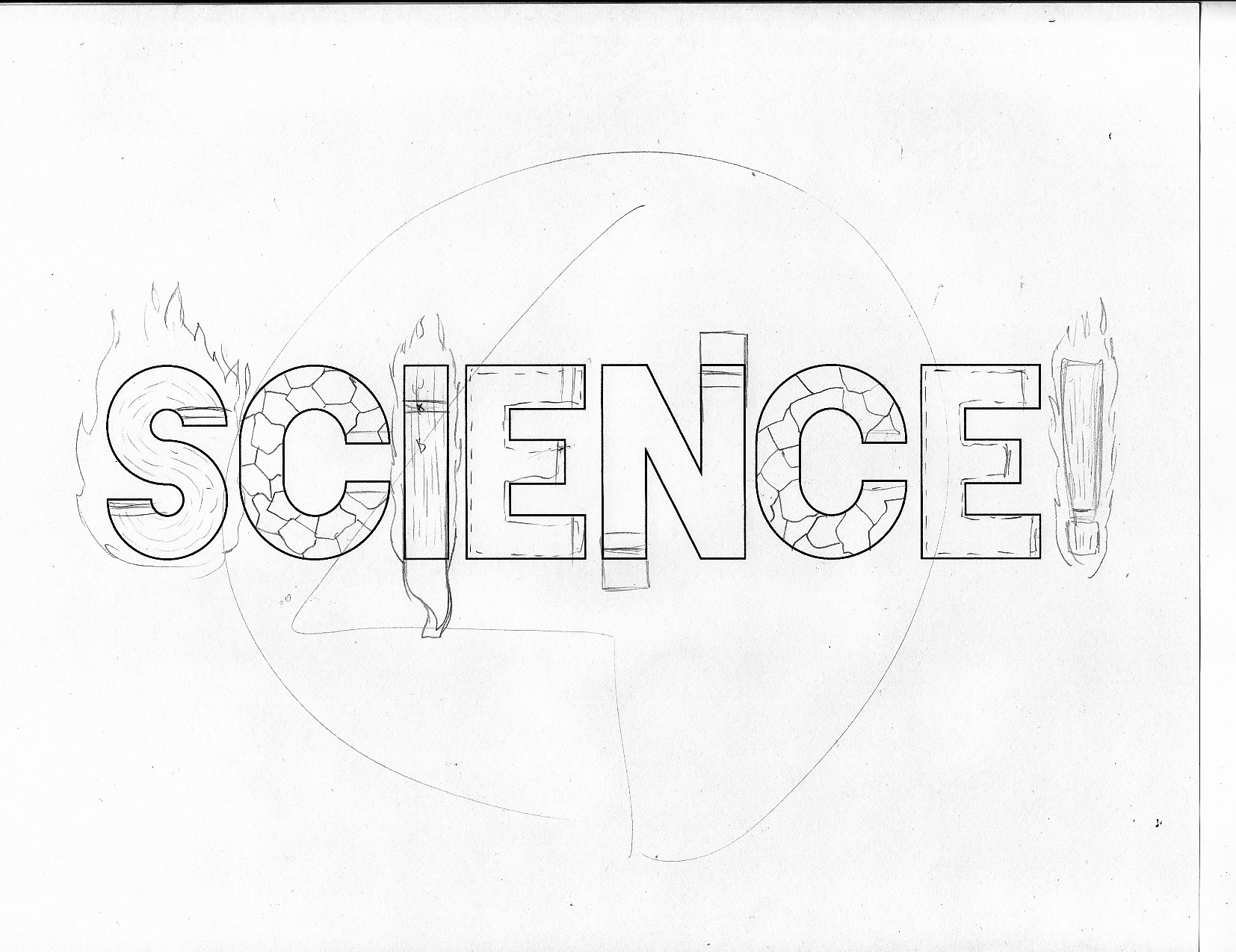
Not many steps went through this project. I followed my initial sketch as much as I could, while making it more iconic by not making the flames too realistic, and using their classic logo as the 4 in the background. The colors were strong in this. Mainly because of the Thing and the Human Torch's color scheme. Invisible Woman's letters were fun to create especially using a gradient when I originally had a solid light blue color. And for Mr. Fantastic I felt the S and the N were perfect without having to do much. Simple changes like these made this appealing to me. I wanted the challenge of how could I take what makes the Fantastic Four special and break it down to it's smallest parts and still be identifiable.
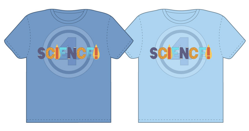
I'm happy to have been able to execute my concept, although in the end I felt I could have done a bit more to either make it stand out more or communicate better. Perhaps maybe too vibrant, so I dulled the colors a bit to give it a more weathered look. And still wondering if the 4 is helping or actually conflicting with the piece. Either way, it took me much longer to finish this than expected but I learned a few things a long the way. Below are examples of what the color palettes for the shirts would ideally be.