Early this year I took part in a design brief from a private label to create a series of wine labels for an upcoming release. Like usual briefs, the direction was left vague with only the title of the wine, Cheeky Fox, and mentioning a competing brand, Apothic in aesthetic.
With that in mind I decided to create one graphic gothic version and two additional ones that served as a classic illustrated one and a modern minimalist one to cover a few bases. Below are just a few notes and sketches for conceptualizing my initial ideas.
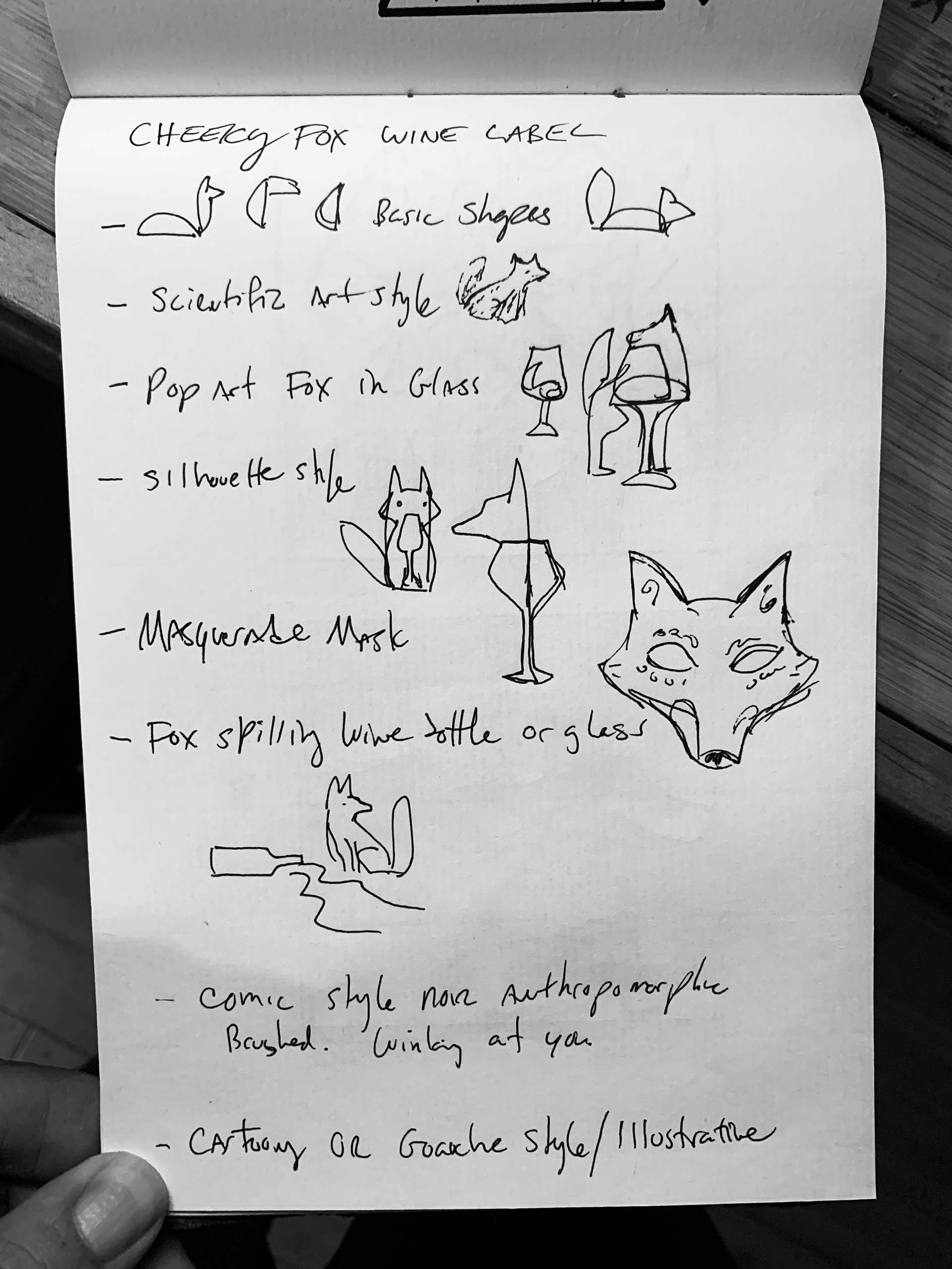
The first image was a list of ideas I initially made for potential designs. Some evolved into the final pieces, as they served a good stepping off point and direction to go to.
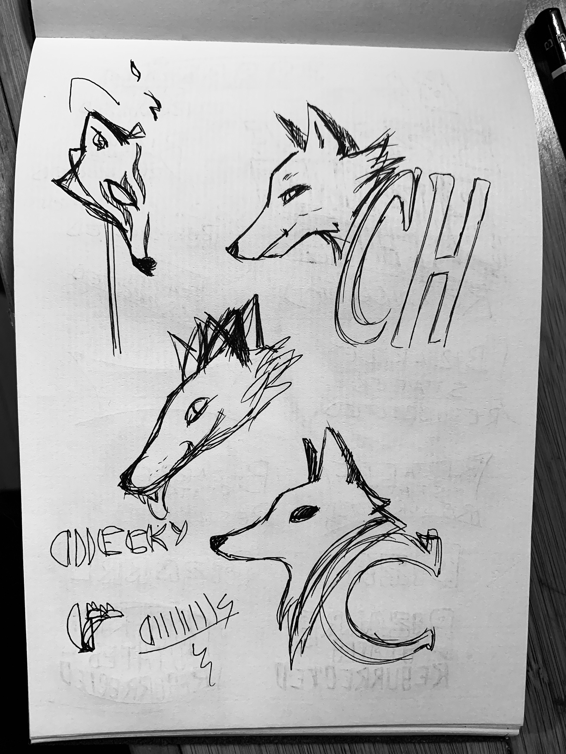
The second image showed the start of a masquerade like fox mask as well as different profile looks to a fox curving around a specific font style.
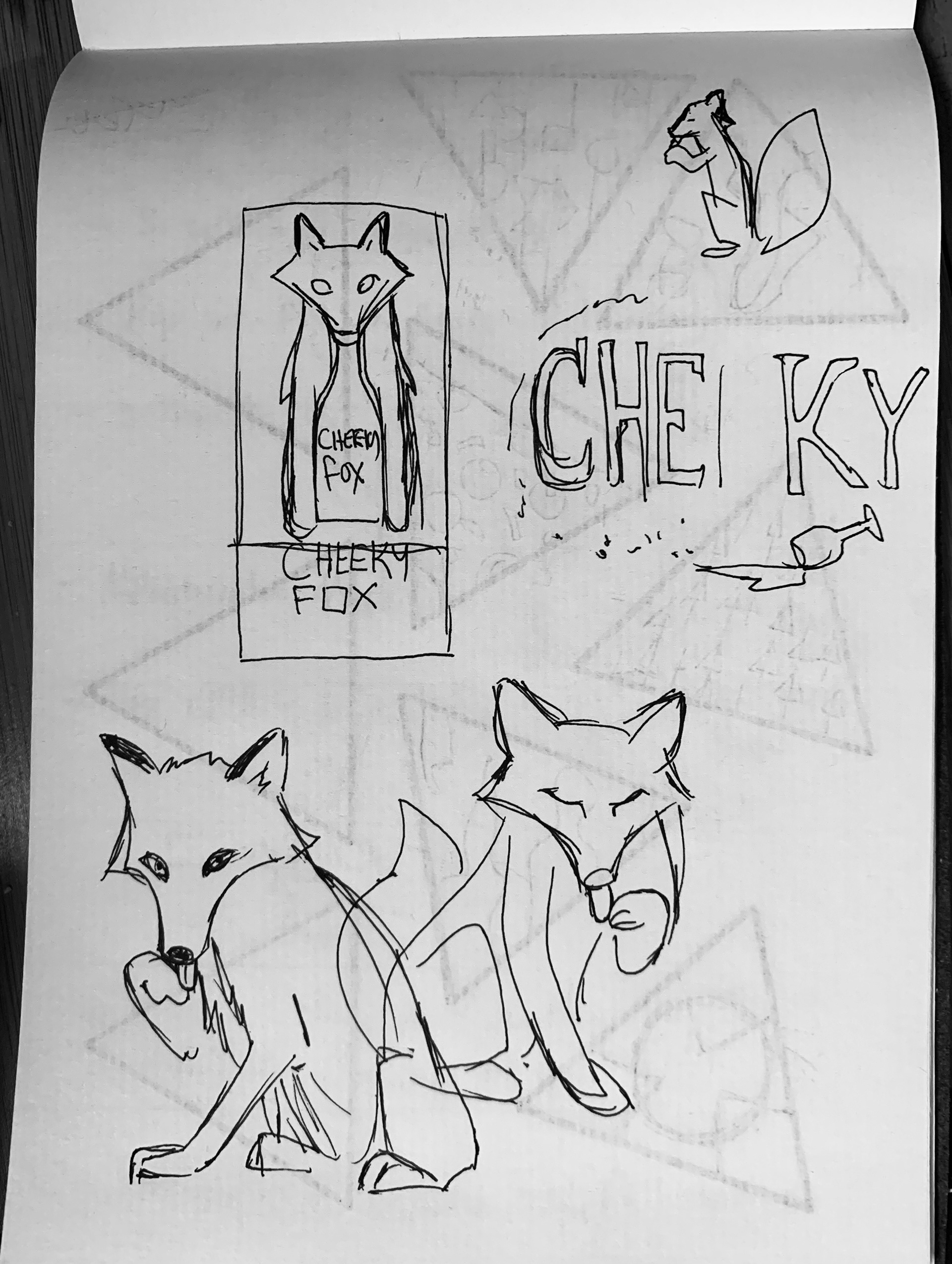
The last image showcases the final two concepts that were pretty much left unchanged in their final forms.
Following these directions I quickly moved into outlining the art in either Photoshop or Illustrator to quickly build the label. As this was mostly for proof of concept they were still fairly polished by rough standards.
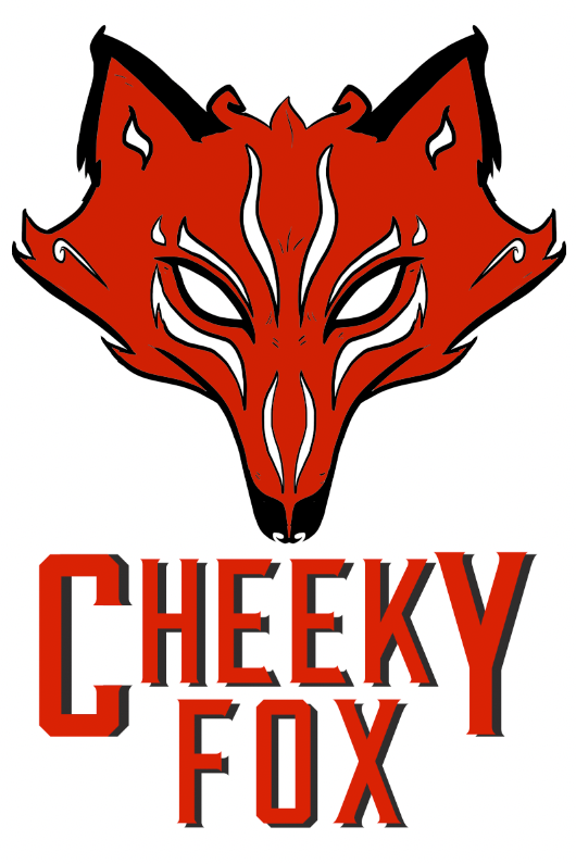
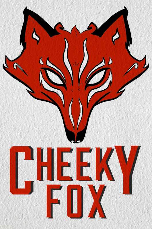
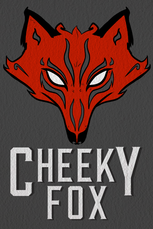
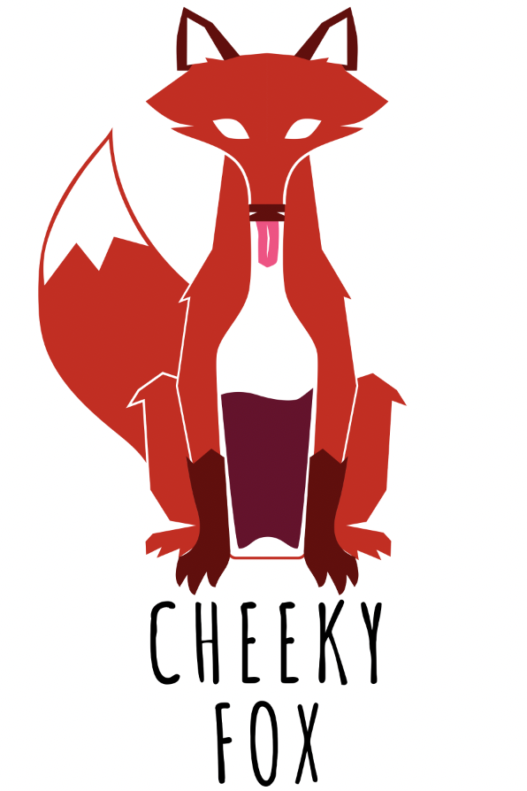
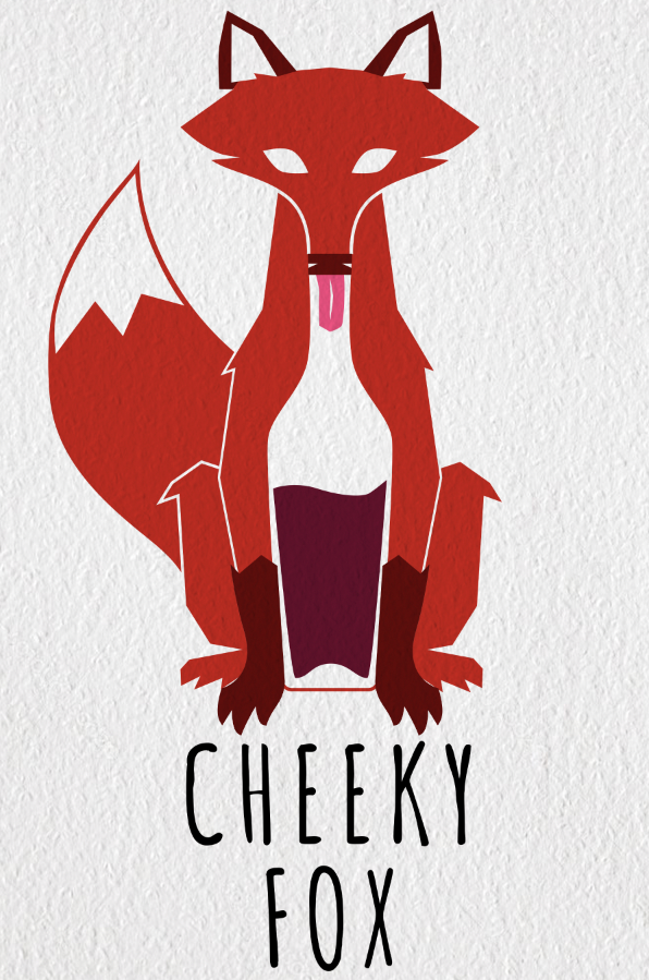
The first one being the masquerade mask went from an actual mask, to just an ornate fox facade. The final versions of this were with a light and dark background with texture to simply give the client the idea of printing on nice cardstock.

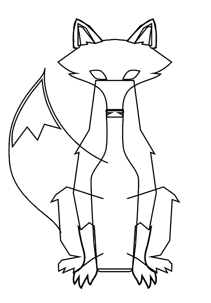
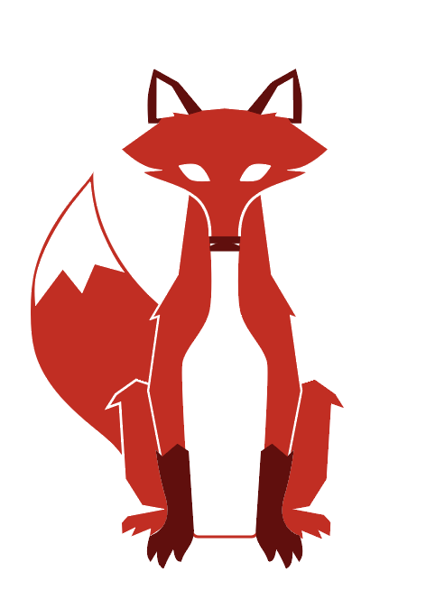
The second was the modernist take which was fairly simple to follow based on the initial sketch, this one being made in Illustrator before carrying it over to Photoshop for the text and texture.
Originally the fox's underbelly was to remain white big shaped as the silhouette of a wine bottle. But then sometimes thunder strikes and you add that special touch that makes it so much better, which in this case was, his tongue in a half full bottle.
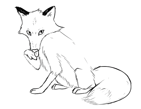
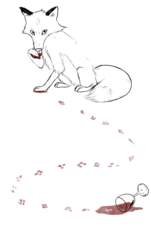
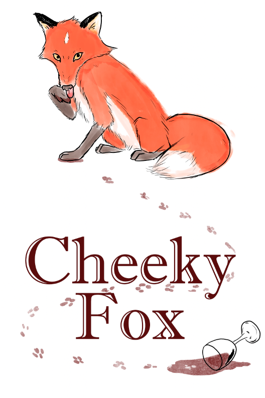
The final option was of the more classic storybook like illustrative label. Giving this wine a bit more experience or age yet retain a playfulness that fit in with the "cheeky" part of the title.
Originally it was just meant to have a fox licking its paw as if it was tasting the wine. But then I the idea of having the fox spilling the wine in it's cheekiness, and tracking it up the label where he's caught red handed licking it off. This was drawn and painted in photoshop with some pen and ink outlines and watercolor coloring for that traditional look I wanted to go for. As a final touch of course, the cardstock texture.

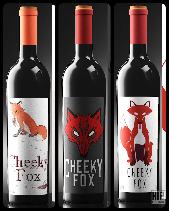
And for added measure I decided to mock these up on actual wine bottles to give a better impression of what they would look like in the real world and mainly because mockups are cool! And are great at showing off your art in a real world setting.
Sadly, none of the designs made it to the final round, but luckily I remained with the original art and license to use them as I see fit and so here's to potentially creating more artwork for wine and beverage companies! I would love to add my mark in that industry as well and I hope this was a good representation of the process in designing for such a task.