I had the great fortune of being asked to design the branding for the popular supernatural podcast, Bizarre States: Resurrected. Having worked with Discovery Channel's Expedition X's Jessica Chobot back in our Nerdist days during the initial run of the original podcast, I was thrilled to be a part of its return.
The direction for this project was to honor the original by updating it's look and keeping it similar. Though this didn't hold too long as the final outcome was vastly different than what we originally had envisioned. For starters, this was the original logo from the Nerdist show.
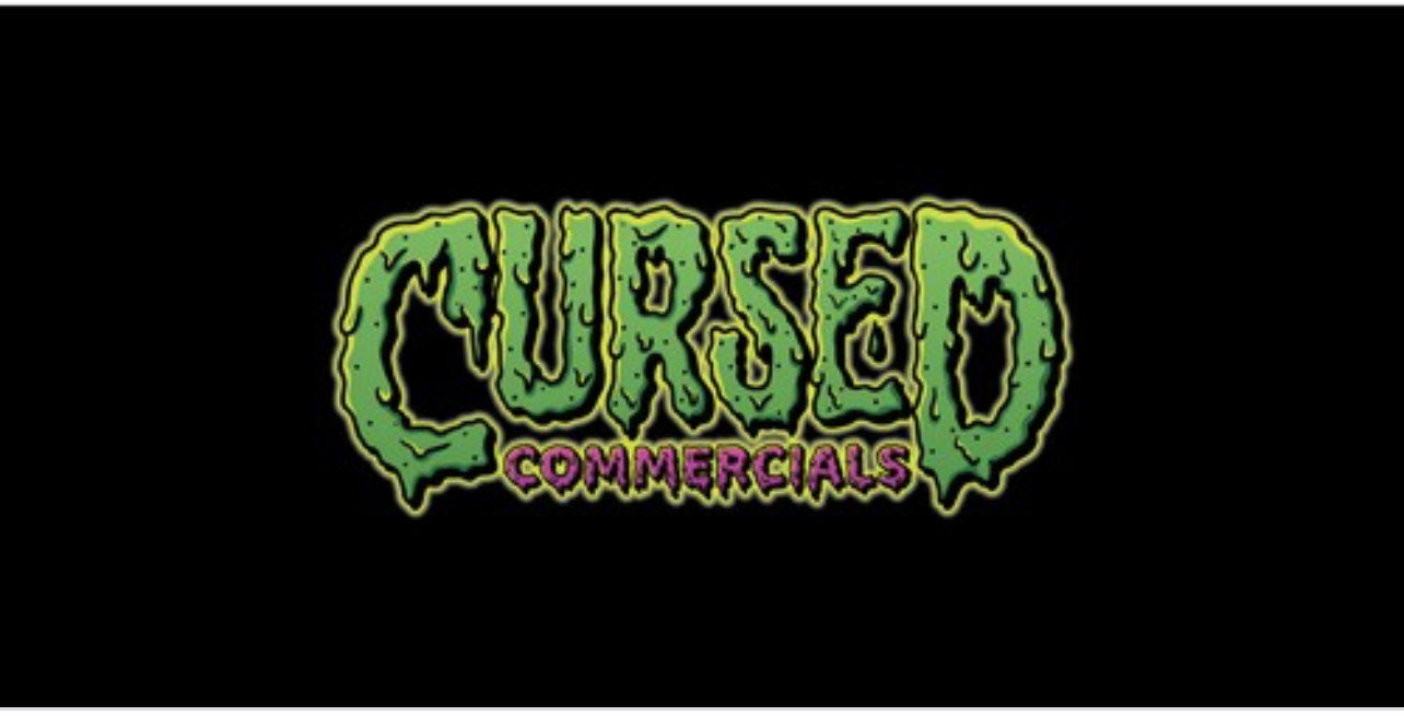
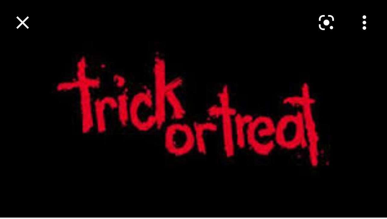
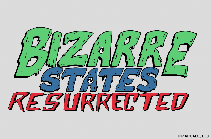
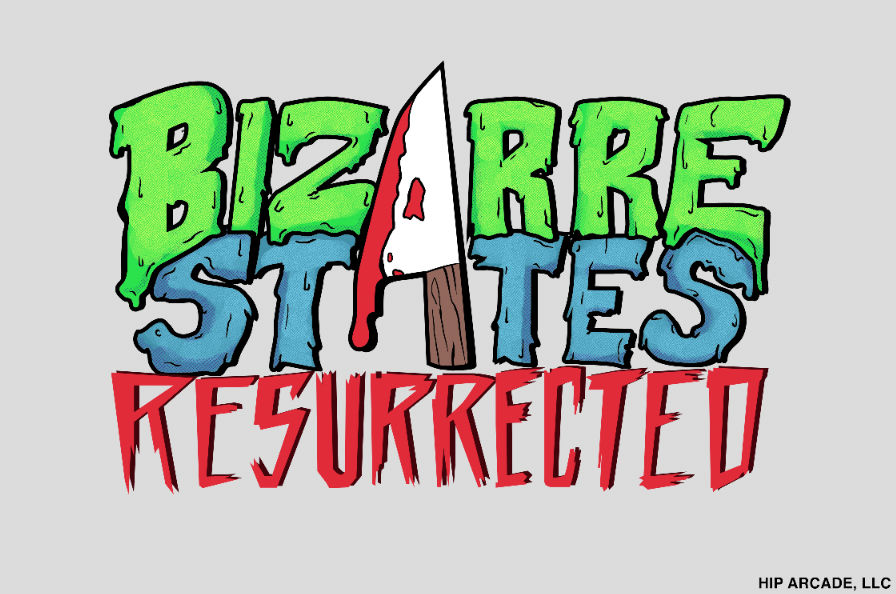
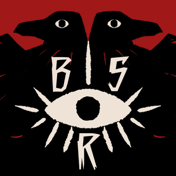
The mood board for the new logo was keeping in line with this more campy horror comic look along with Goosebumps and Cursed! vibes. There was also a directive to try and create a piece of the font as an icon that could be used in thumbnails, like a previous podcast logo they had. The trick or treat style was meant to be for the Resurrected subtitle. The biggest direction was that it was to be completely text based and nothing illustrated.
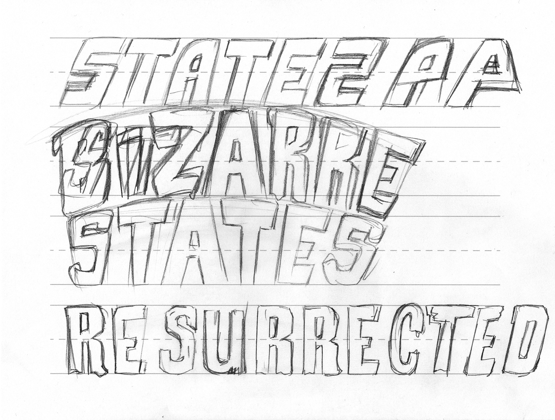
Following these directives I went on to create my own illustrated type to convey what we were going for. Typically I prefer to create my own text when it comes to something regarding branding or logos rather than to use pre-existing fonts. So below you'll get an idea of the kind of type I was creating.
A quick way to sketch out type is using grid paper, but as an alternative, I created my own guides in Illustrator that I then printed out to sketch on, and these were the initial results.
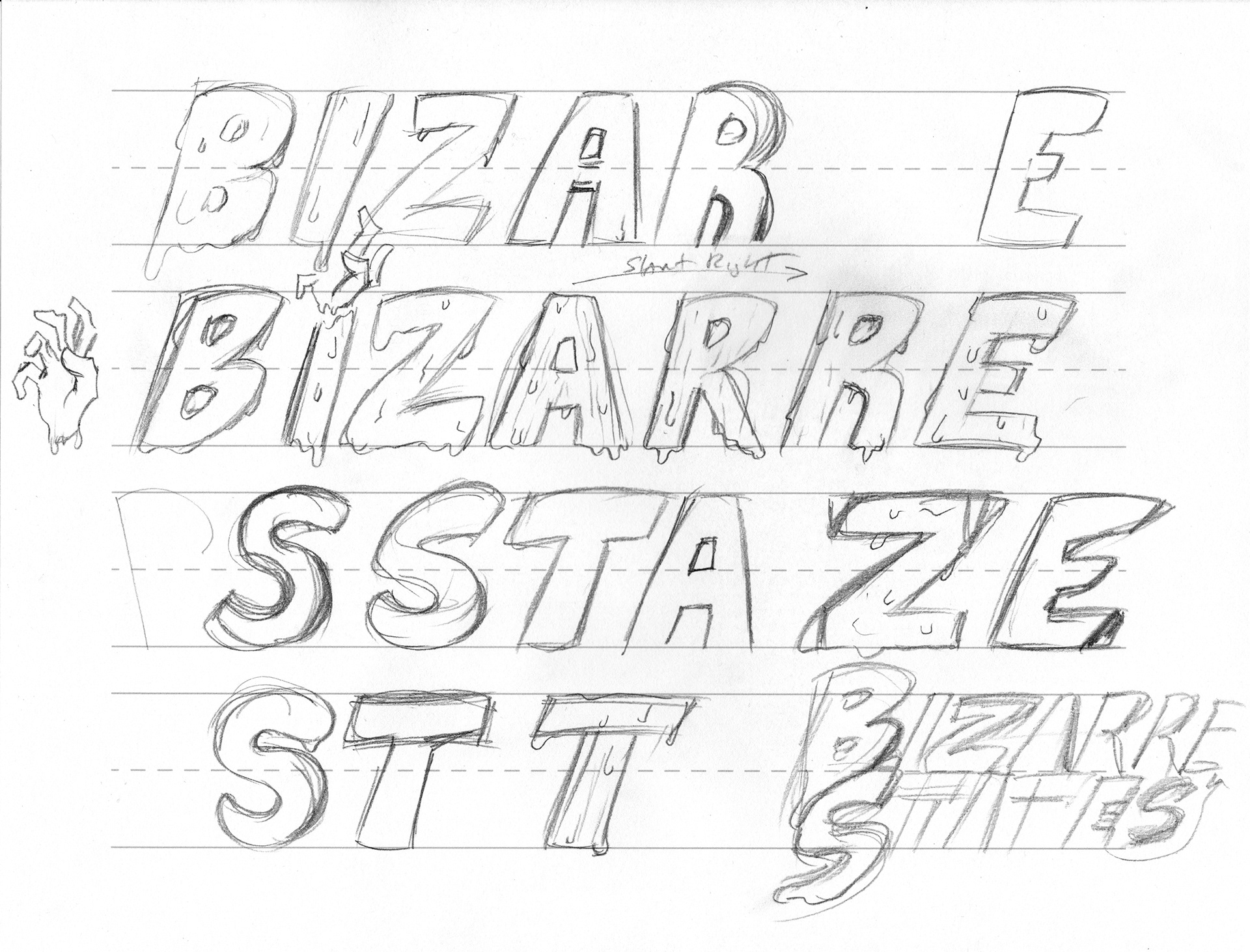
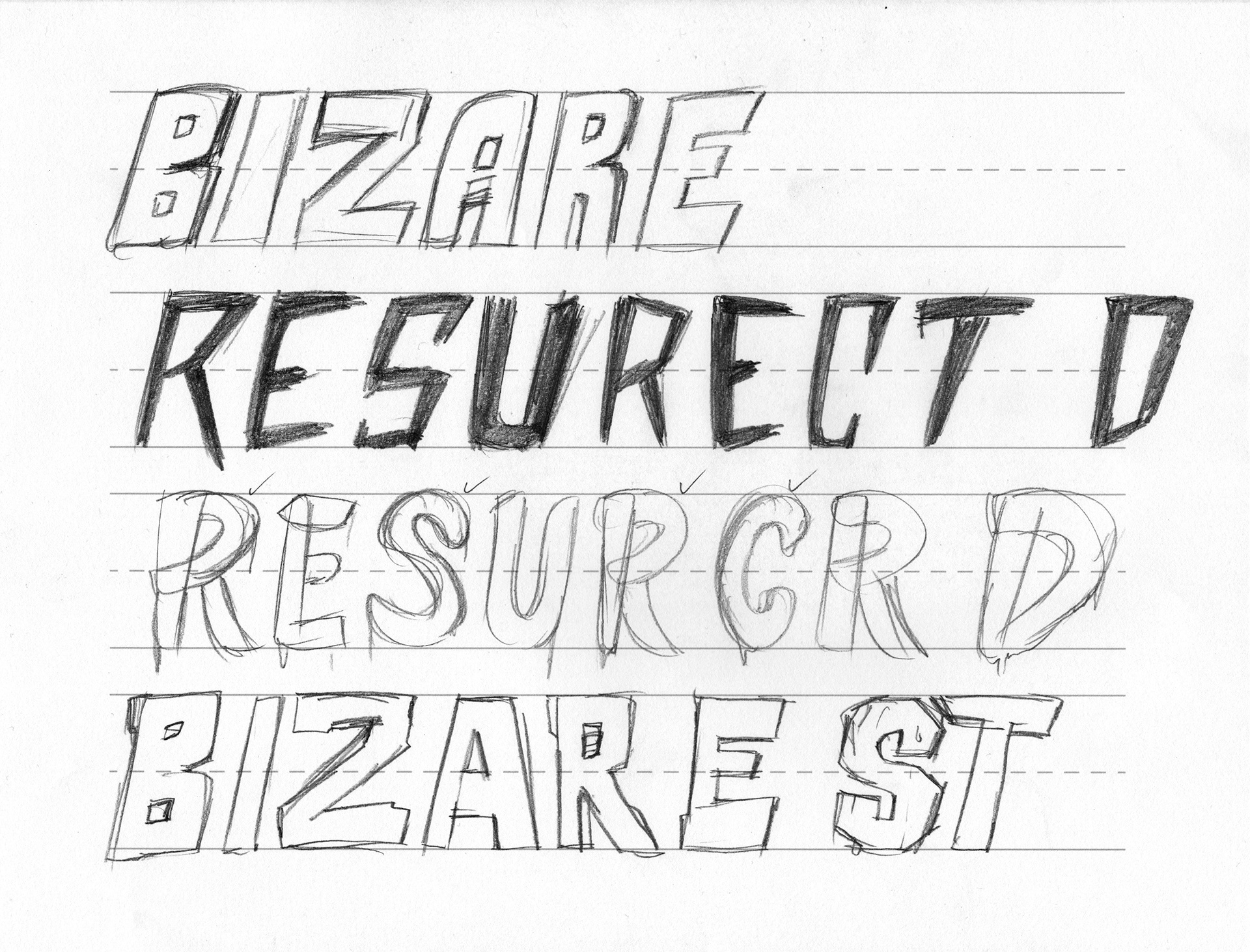
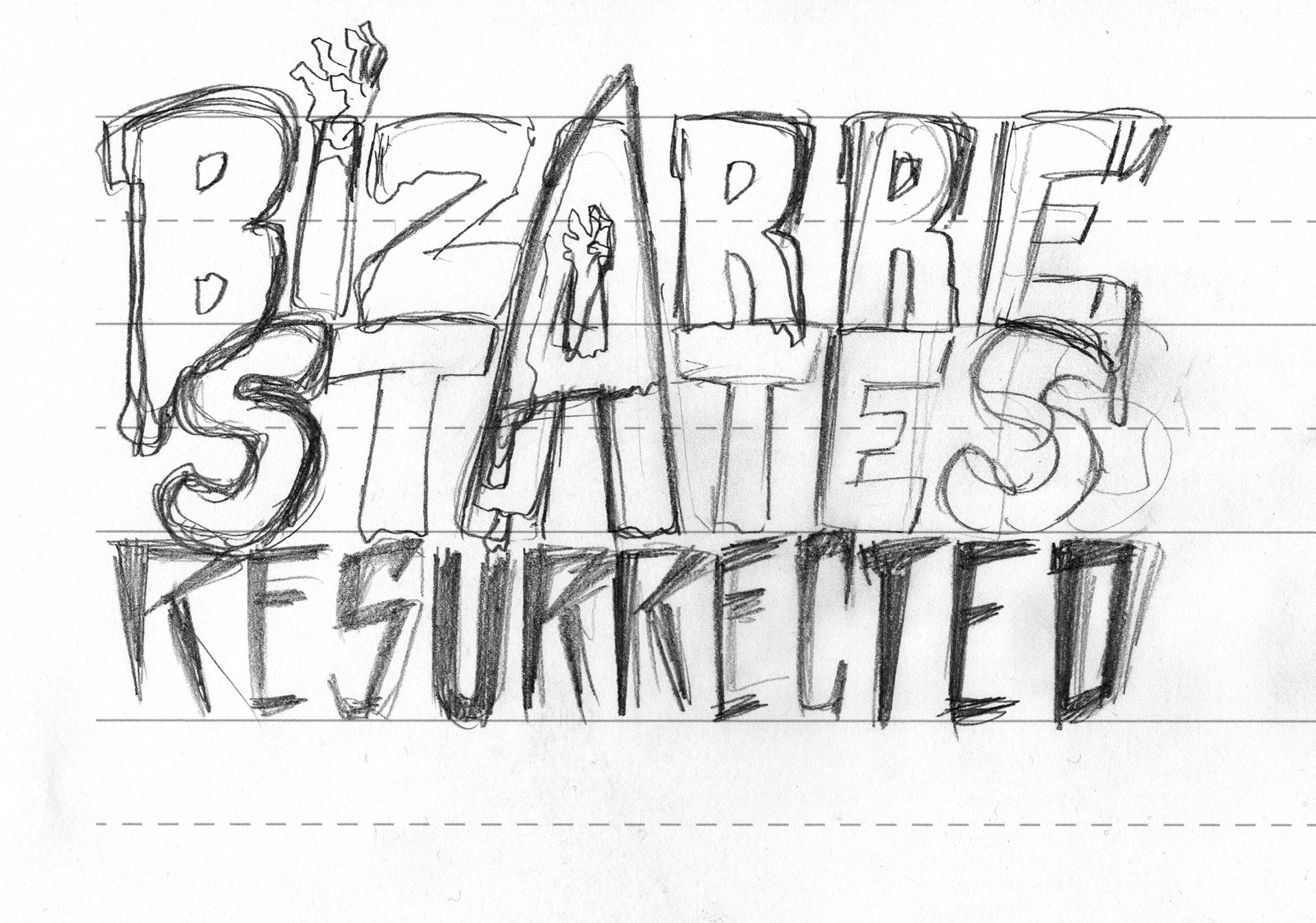
Following these styles I decided to quickly outline them in Illustrator to start building them up, and matching them to their respective styles. Although they were in line with the directions, they just didn't feel very cohesive. The color was added later in Photoshop.
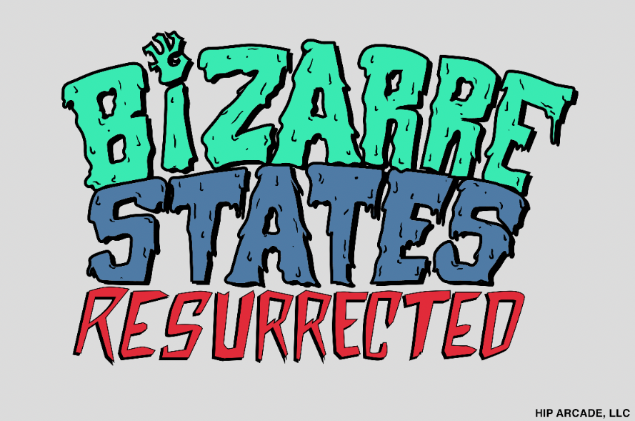
Despite the color choices, the overall look still came off as a bit too campy and almost childlike. I decided to scrap this idea and try something completely different. Given the nature of the show, I decided to go in a more traditional illustrative style that matched more in line with the supernatural tone of the show as well as the interests of its host.
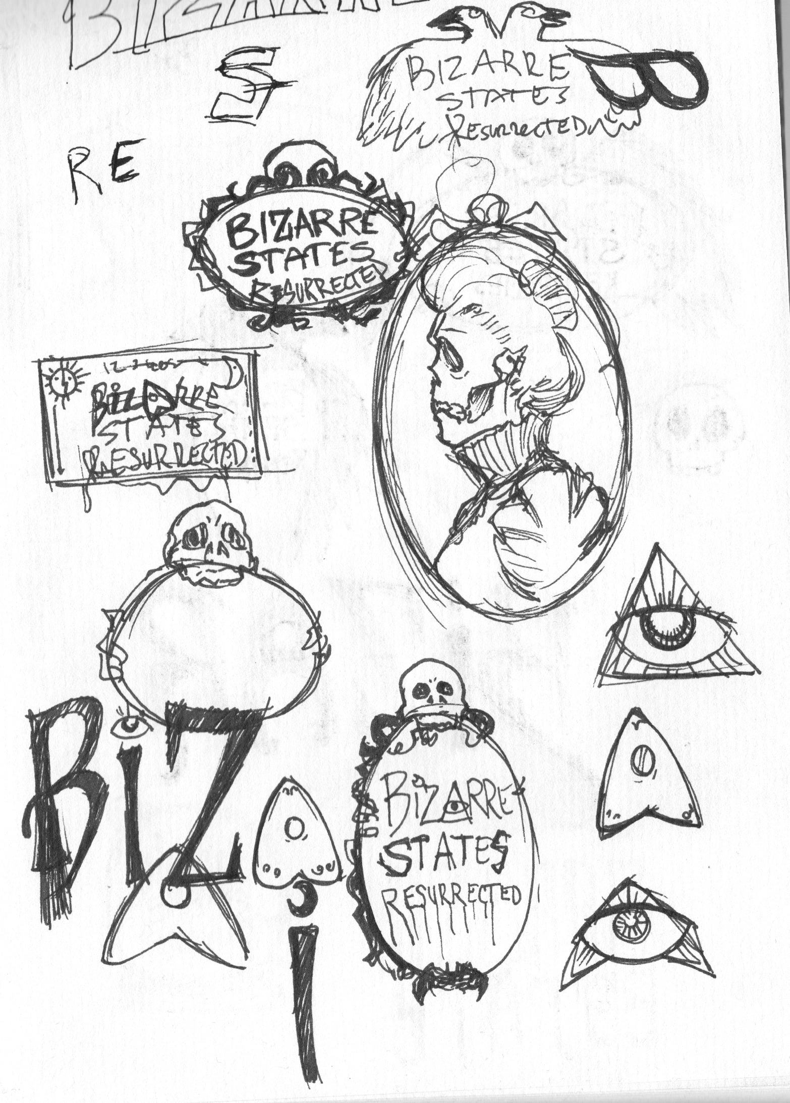
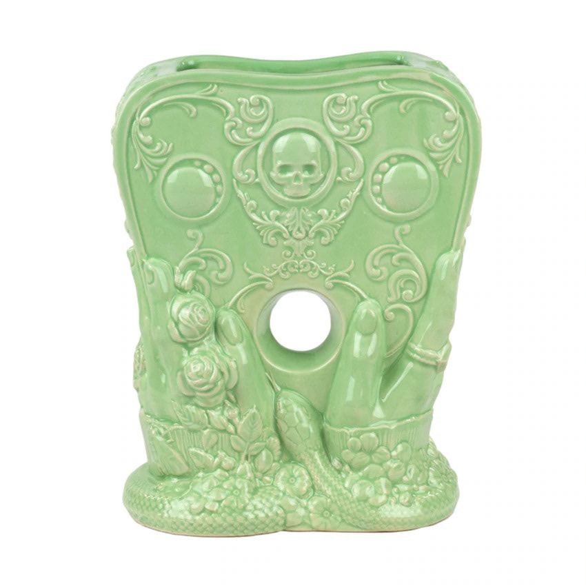
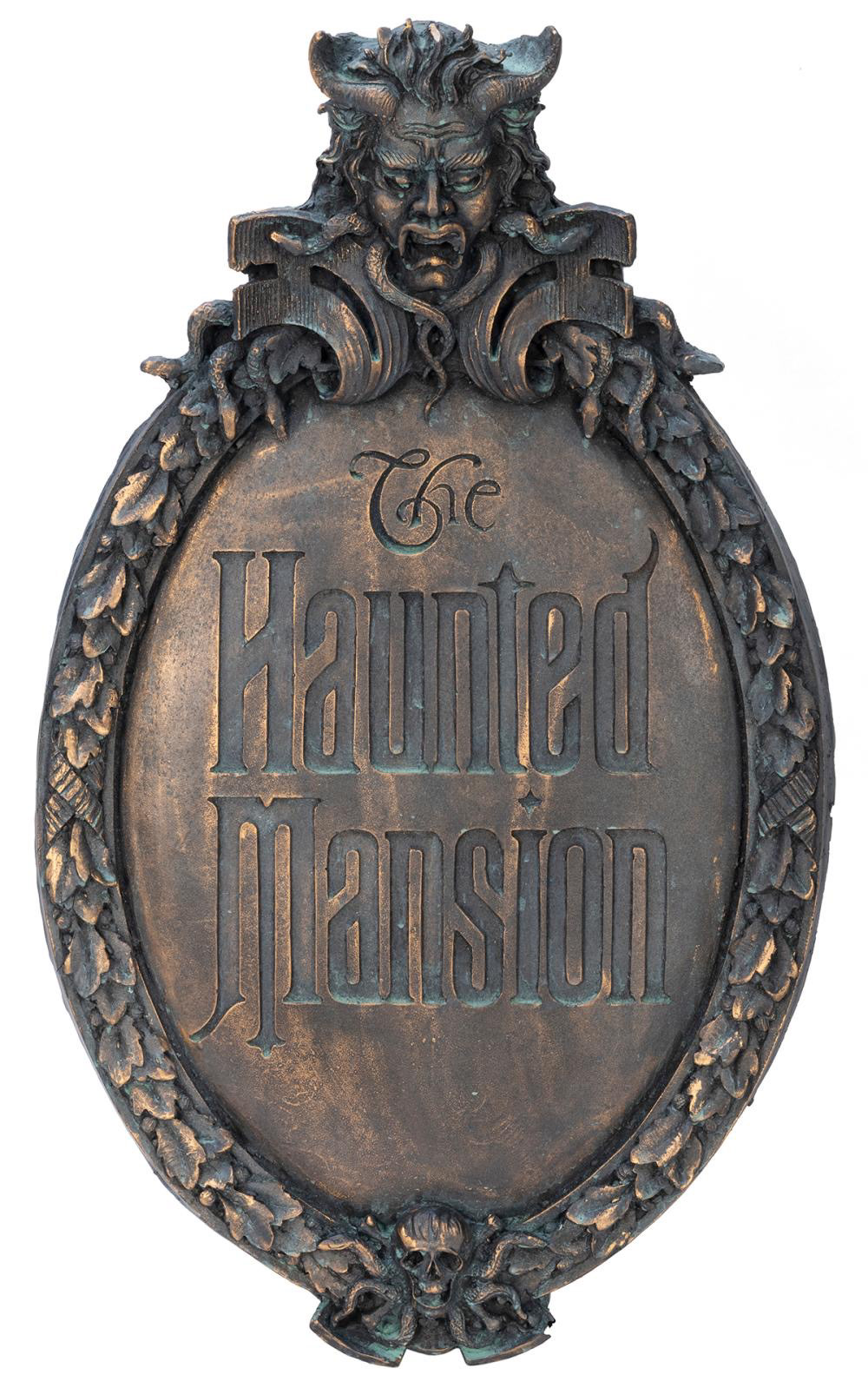
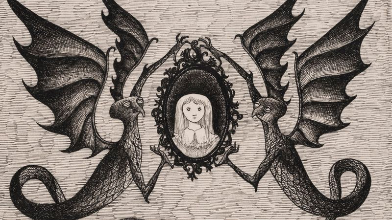
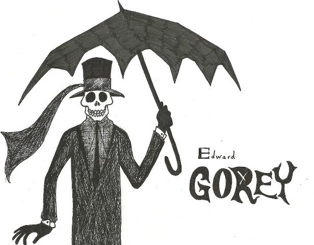
The very first thing I sketched was a portrait of a female skeleton in period attire, and then I got more vibes that reminded me of Guillermo del Toro's works. Thinking back on the trinkets and designs of Hellboy, Lovecraft, Gorey and Mignola as well. Aesthetics that pushed me to create more designs based on those old practices, scrying, runes, seances and so much more.
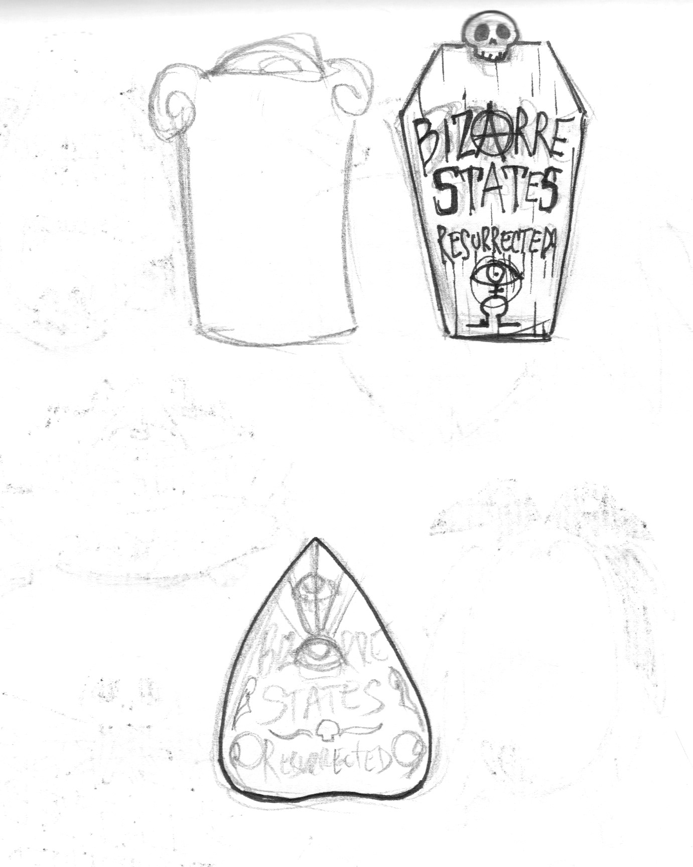
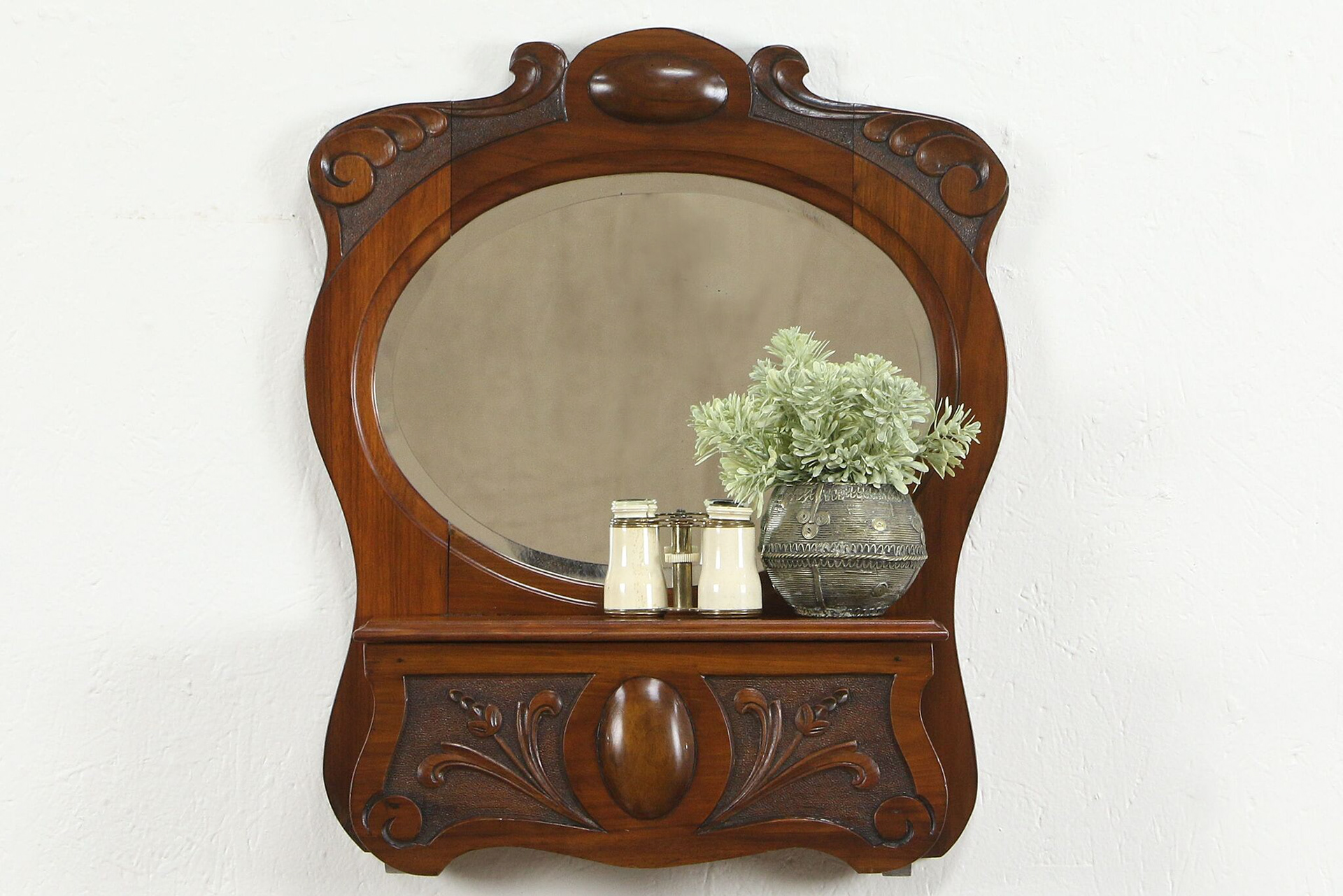
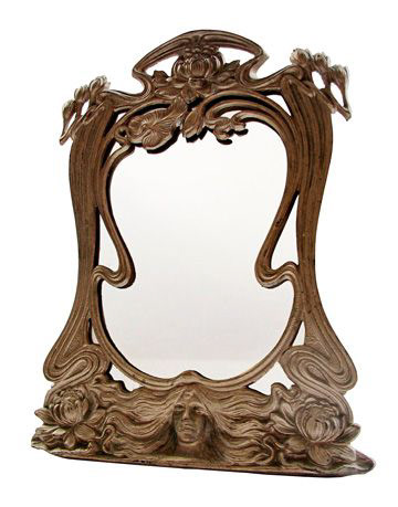
So I focused on the mirror as it would give me a large enough space to fit the title (text I had yet to resolve), and pushed that with a few different things as can be seen in the second sketch above. Then I decided to create my own mood board to keep myself focused.
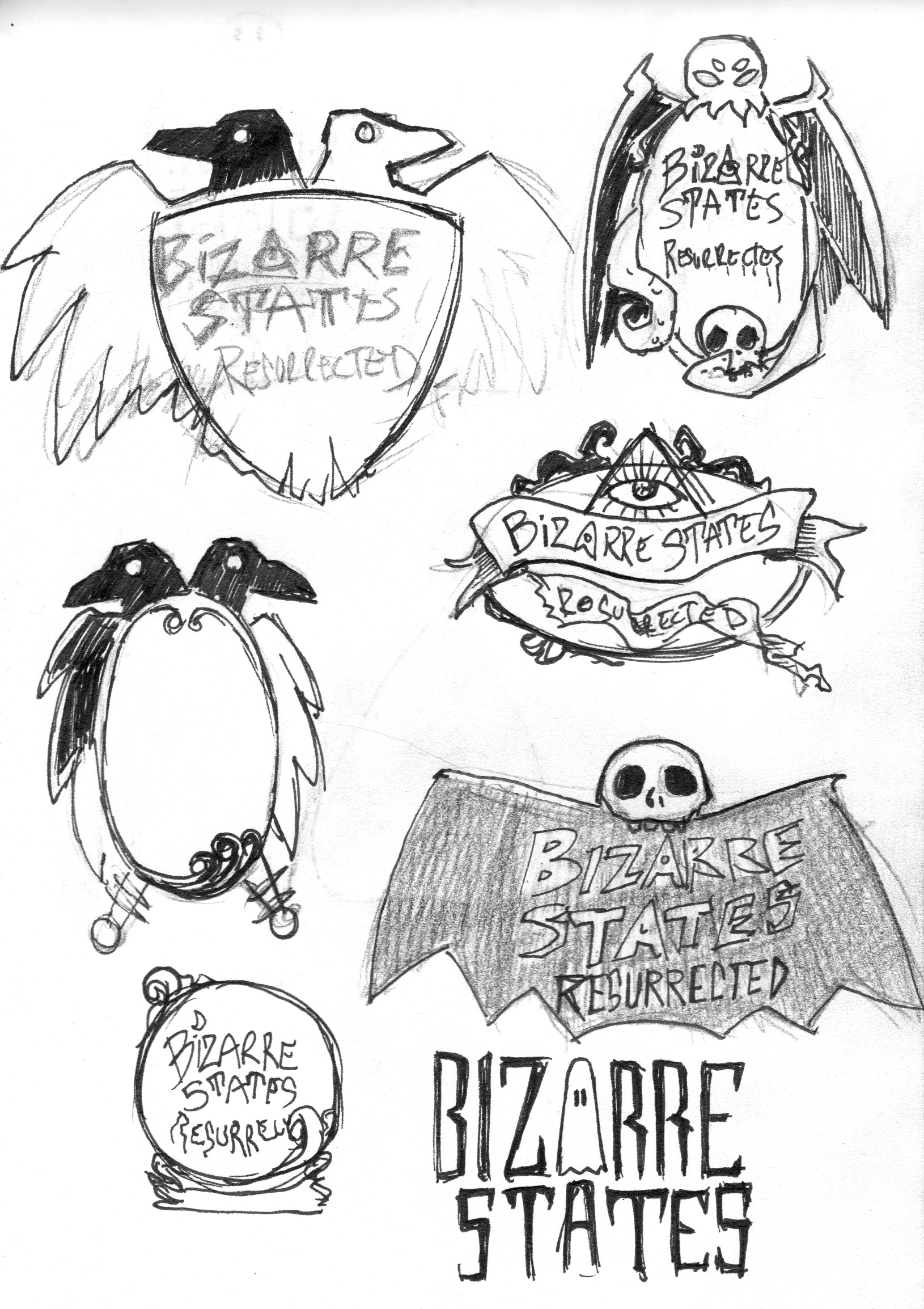
Luckily, Jessica loved the idea and direction and fully embraced this path, scrapping the initial direction and singled out the mirror designs, mainly that of the two headed crow, the Cthulhu and skull wrapped frames. These were those designs fully imagined below.
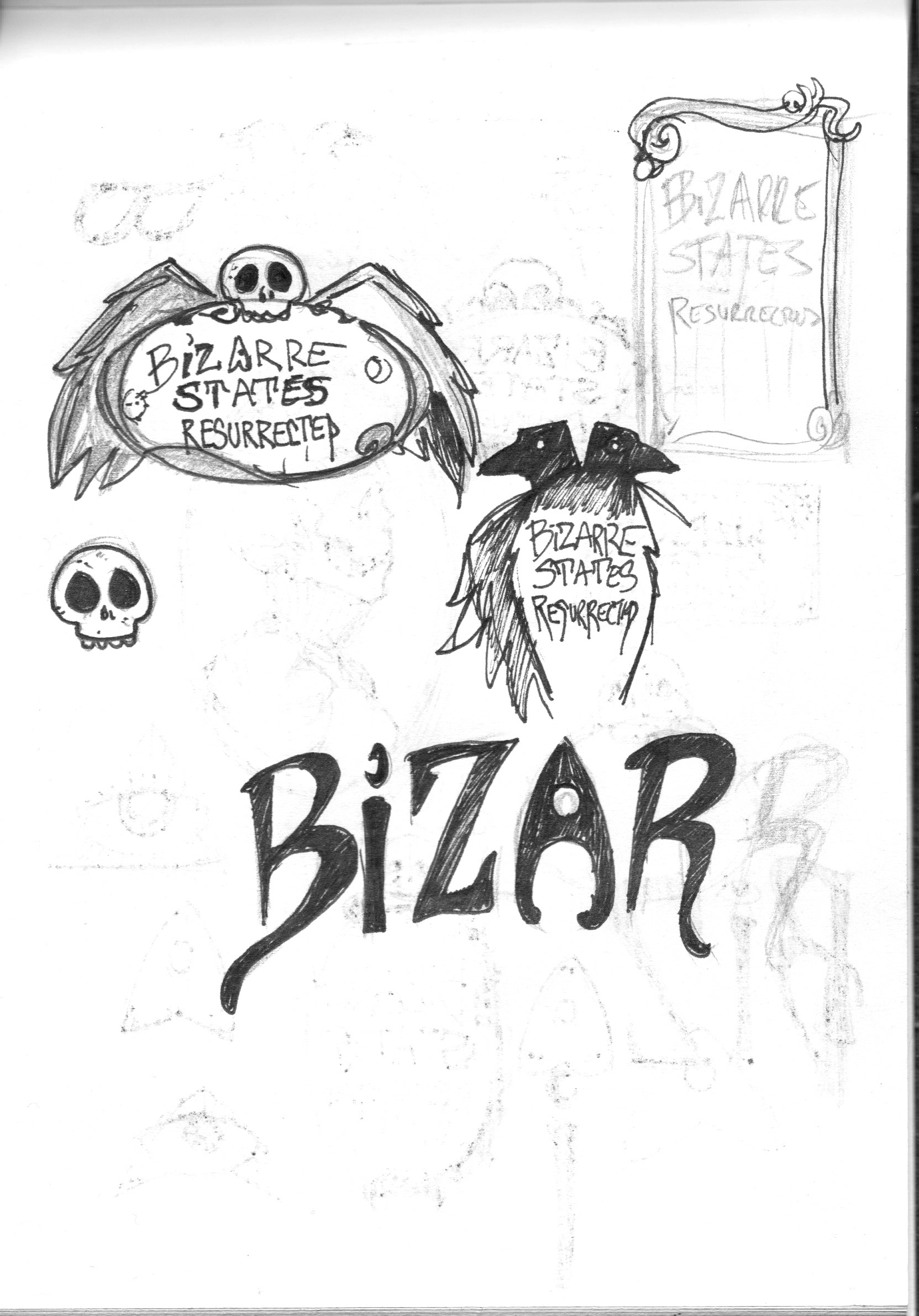
But as you can see I decided to not make the two headed ravens into a mirror but of a full raven instead as the idea of a two headed raven is a sort of omen in the occult. And decided to keep that one very sketchy, as if it was scrawled with charcoal and chalk.
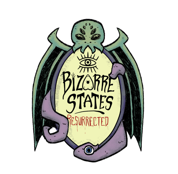
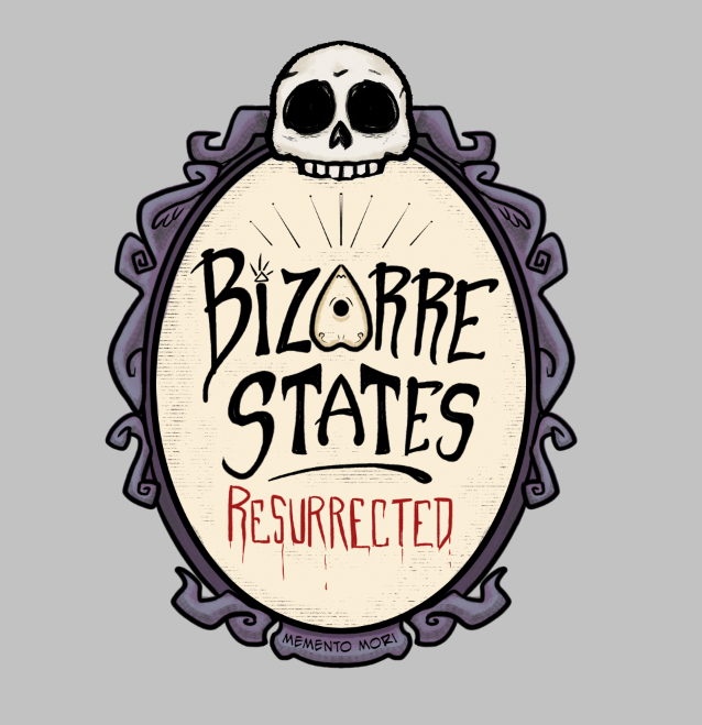
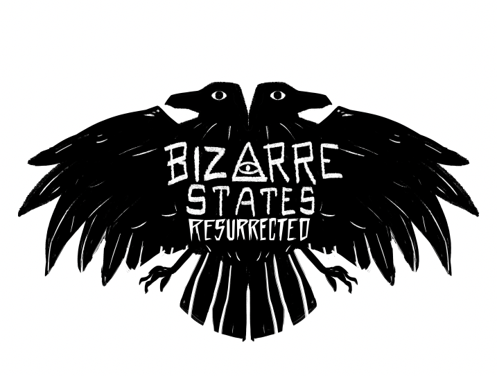
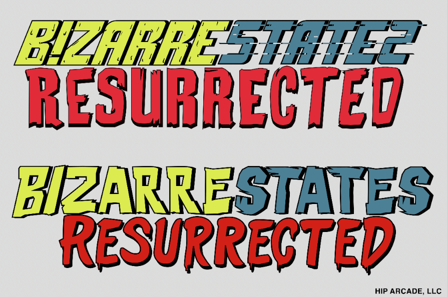
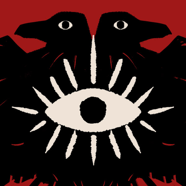
Ultimately it was the crow design that the client loved the most, and so we pushed that even further into it's final form that had a more solid looking text title, along with the all seeing evil eye above the heads rather than being part of the text, and a stark red background to make it all pop.
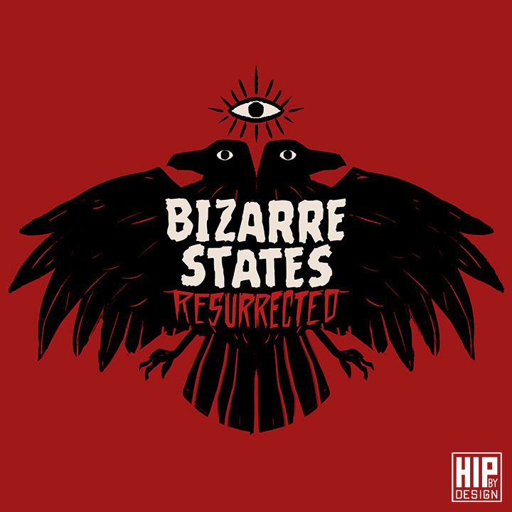
The client was thrilled with this final design that we had decided to move it into merchandising as well as other parts of branding; changing bits and pieces or abbreviating the title to fit into thumbnails and other areas for social media and such.

I'm super happy with this logo and branding. One that came out of seemingly nowhere given the original direction. There are times where you really do need to pivot and scrap what you originally had, to create something completely different, and ultimately, really true to the client's vision. Even if they didn't know it at the time.